25. Do a research about the most interesting statistical charts and make plans to include them in your own personal library.
One goal of statistics is to present data in a meaningful way. Often, data sets involve millions (if not billions) of values. This is far too many to print out in a journal article or sidebar of a magazine story. That’s where graphs can be invaluable, allowing statisticians to provide a visual interpretation of complex numerical stories. Types of graphs that are commonly used in statistics.
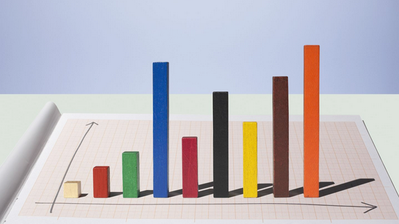
1. Pareto Diagram or Bar Graph
A Pareto diagram or bar graph is a way to visually represent qualitative data. Data is displayed either horizontally or vertically and allows viewers to compare items, such as amounts, characteristics, times, and frequency. The bars are arranged in order of frequency, so more important categories are emphasized. By looking at all the bars, it is easy to tell at a glance which categories in a set of data dominate the others.
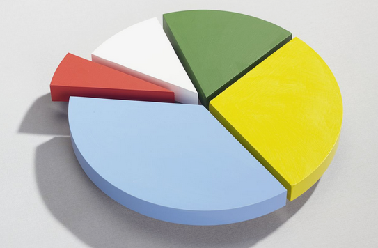
### 2. Pie Chart or Circle Graph
Another common way to represent data graphically is a pie chart. It gets its name from the way it looks, just like a circular pie that has been cut into several slices. This kind of graph is helpful when graphing qualitative data, where the information describes a trait or attribute and is not numerical. Each slice of pie represents a different category, and each trait corresponds to a different slice of the pie; some slices usually noticeably larger than others. By looking at all of the pie pieces, you can compare how much of the data fits in each category, or slice.
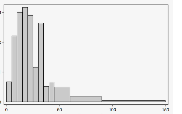
### 3. Histogram
A histogram in another kind of graph that uses bars in its display. This type of graph is used with quantitative data. Ranges of values, called classes, are listed at the bottom, and the classes with greater frequencies have taller bars.
### 4. Scatter Plot
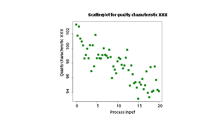
A scatter plot can be used either when one continuous variable that is under the control of the experimenter and the other depends on it or when both continuous variables are independent. If a parameter exists that is systematically incremented and/or decremented by the other, it is called the control parameter or independent variable and is customarily plotted along the horizontal axis. The measured or dependent variable is customarily plotted along the vertical axis. If no dependent variable exists, either type of variable can be plotted on either axis and a scatter plot will illustrate only the degree of correlation (not causation) between two variables. A scatter plot can suggest various kinds of correlations between variables with a certain confidence interval.
### 5. Polar Chart
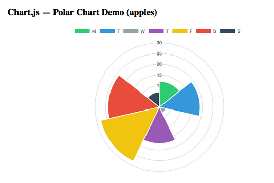
The polar area diagram is similar to a usual pie chart, except sectors have equal angles and differ rather in how far each sector extends from the center of the circle.
### 6. Waffle chart
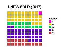
Waffle Charts are a form of pie charts that use squares instead of circles to represent percentages. Similar to basic circular pie charts, square pie charts take each percentage out of a total 100%.They are usually 10×10 grids, where each cell represents 1%. Despite the name, circles, pictograms (such as of people), and other shapes may be used instead of squares. The benefit to these is that it is easier to depict smaller percentages that would be hard to see on traditional pie charts.
### 7. Doughnut chart
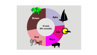
A doughnut chart (also spelled donut) is a variant of the pie chart, with a blank center allowing for additional information about the data as a whole to be included. Doughnut charts are similar to pie charts in that their aim is to illustrate proportions.
### 8. Box plot
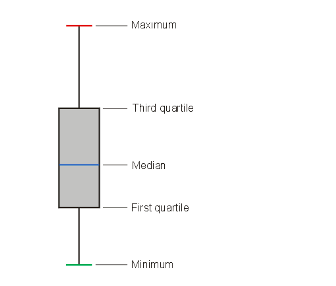
A box plot is a graphical representation of statistical data based on the minimum, first quartile, median, third quartile, and maximum. The term “box plot” comes from the fact that the graph looks like a rectangle with lines extending from the top and bottom. Because of the extending lines, this type of graph is sometimes called a box-and-whisker plot. In a typical box plot, the top of the rectangle indicates the third quartile, a horizontal line near the middle of the rectangle indicates the median, and the bottom of the rectangle indicates the first quartile. A vertical line extends from the top of the rectangle to indicate the maximum value, and another vertical line extends from the bottom of the rectangle to indicate the minimum value. The illustration shows a generic example of a box plot with the maximum, third quartile, median, first quartile, and minimum values labeled. The relative vertical spacing between the labels reflects the values of the variable in proportion.
